Timeline
-
2018 MVP & User Testing
-
2018 30-Day Optimism Challenge
-
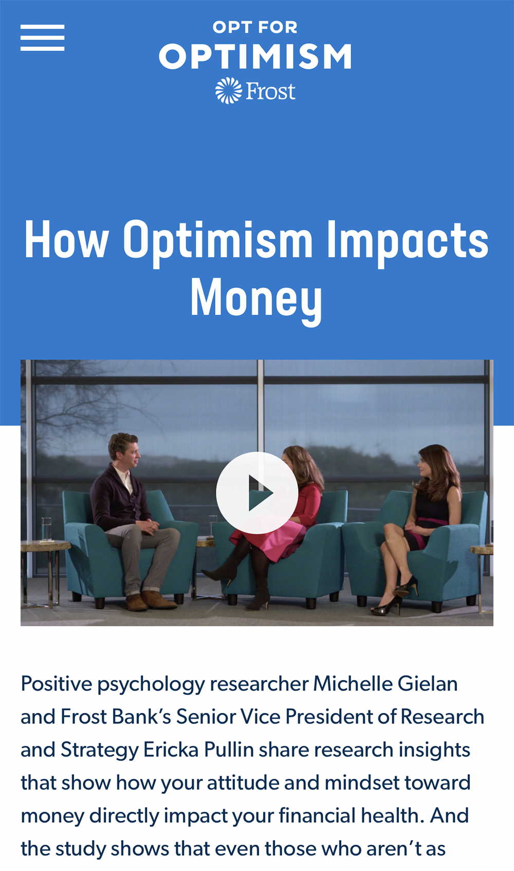
2019 Redesign with Video Series
-
2020 New Feature: Advice Column
-
2020 New Feature: Covid At Home Challenge
My Roles
-
UX/UI Direction
-
Creative Direction
-
Lead UX Strategy & Research
Deliverables
-
Conceptual ideation
-
Content Strategy
-
Wireframes
-
Design
-
Prototypes
-
User Testing
-
Automated Email Program
Challenge
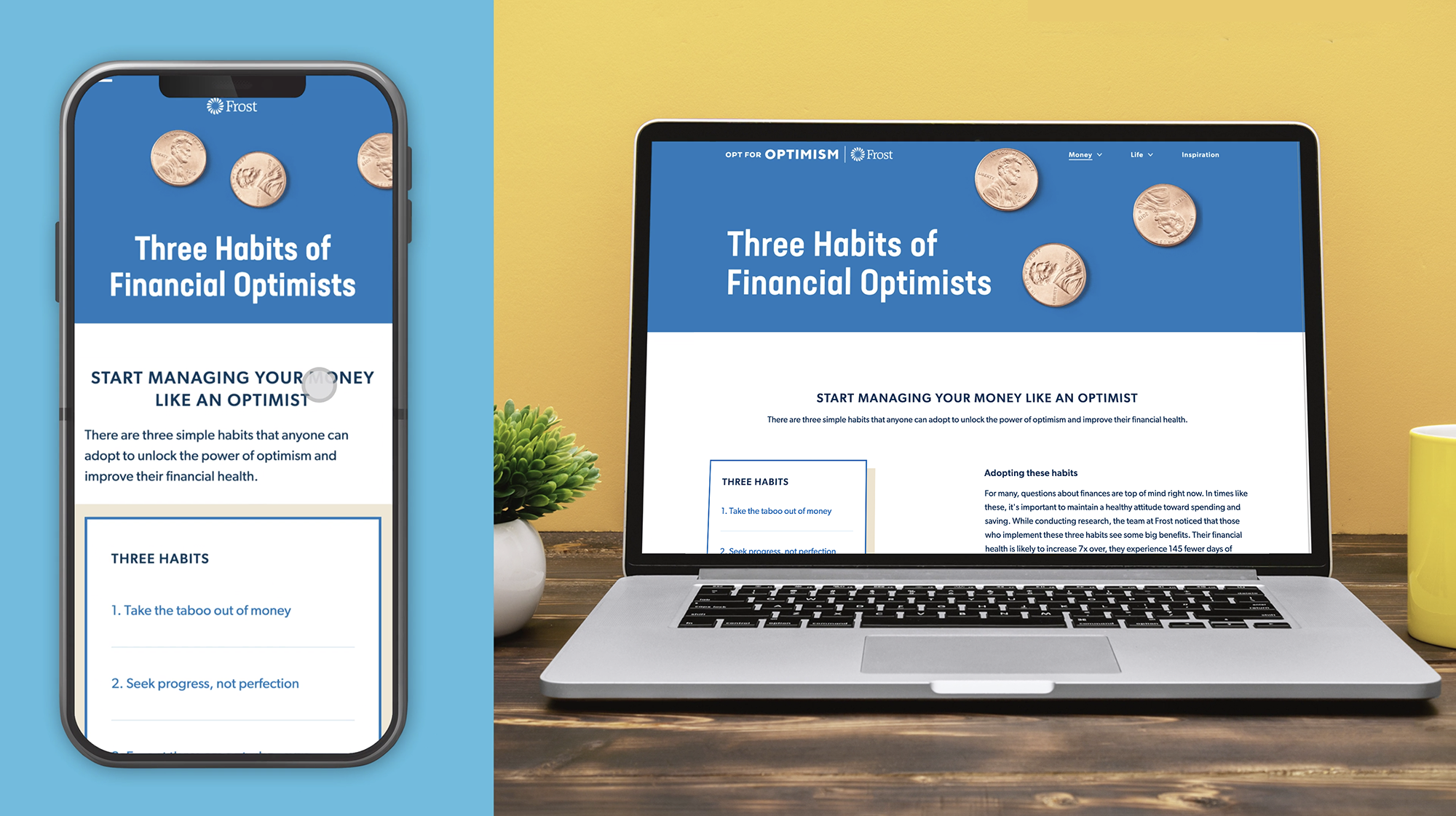
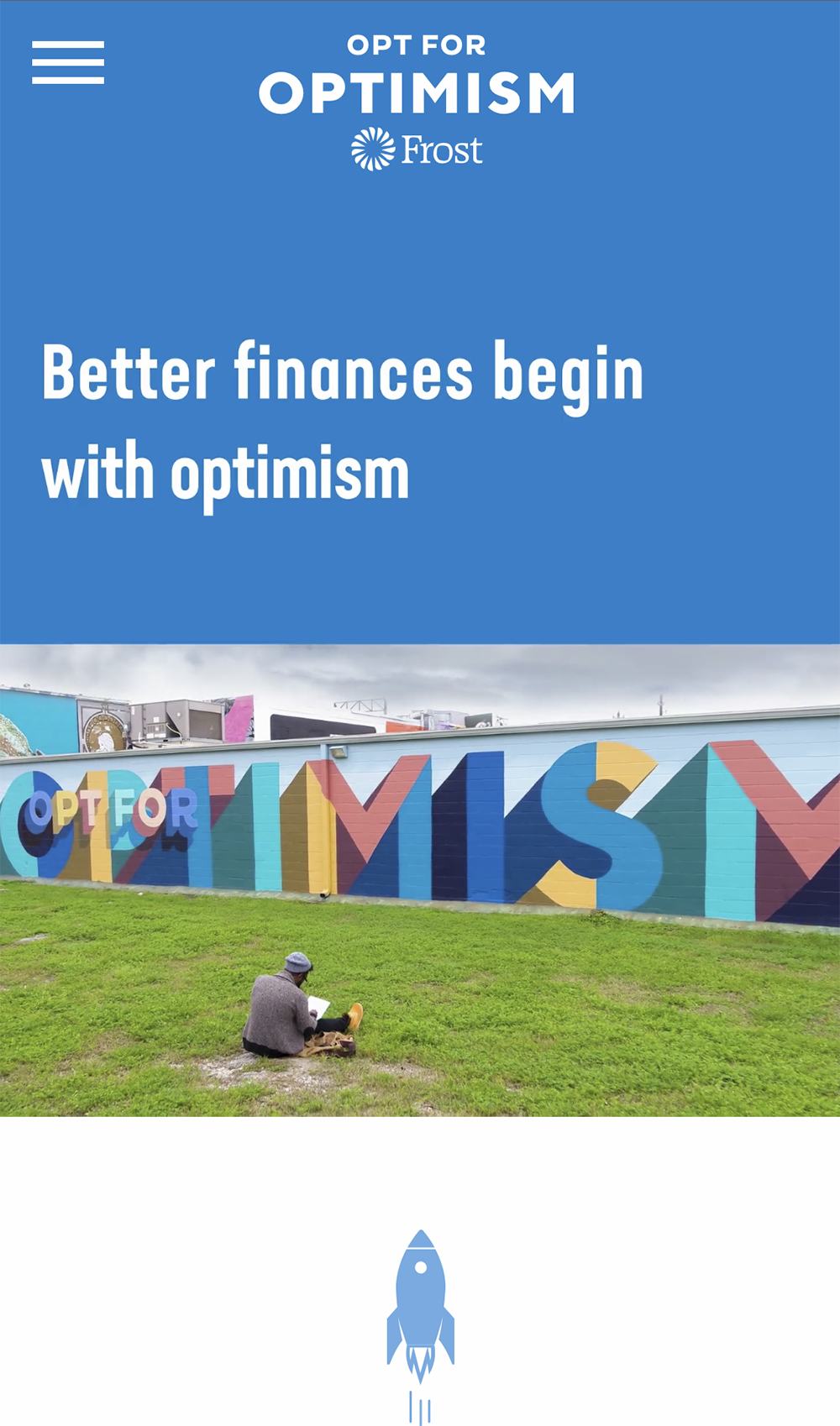
Opt for Optimism was a multi-year marketing initiative McGarrah Jessee created on behalf of Frost bank. The iniatitive was created based on research correlating optimism and financial health. The overarching goal was to improve people's relationship with money by increasing their optimism and teaching them the habits of optimists. When we set out to create a campaign website, we had to identify what role the website should play for our audience.
Audience
Our primary audiences were millenial pessimists and optimists looking to improve their financial health.
Solution
Through a user-centered approach I identified that users would not be satisfied with just reading about the correlation between optimism and financial health. Upon learning about the connection, they will want to take action toward improving their mindsets and financial health.
With a millennial audience in mind we determined the website should play a heavy role in the initiative by facilitating not only the discovery but also the adoption of optimism as a daily habit. Through the course of 2.5 years, we launched several onsite features to enable users to act like an optimist
30-Day Optimism Challenge
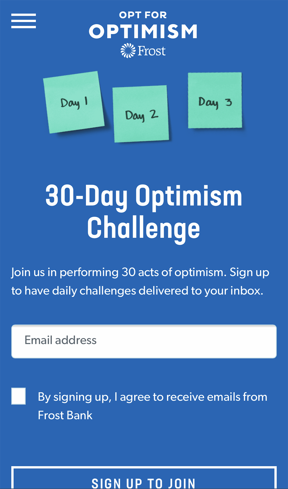
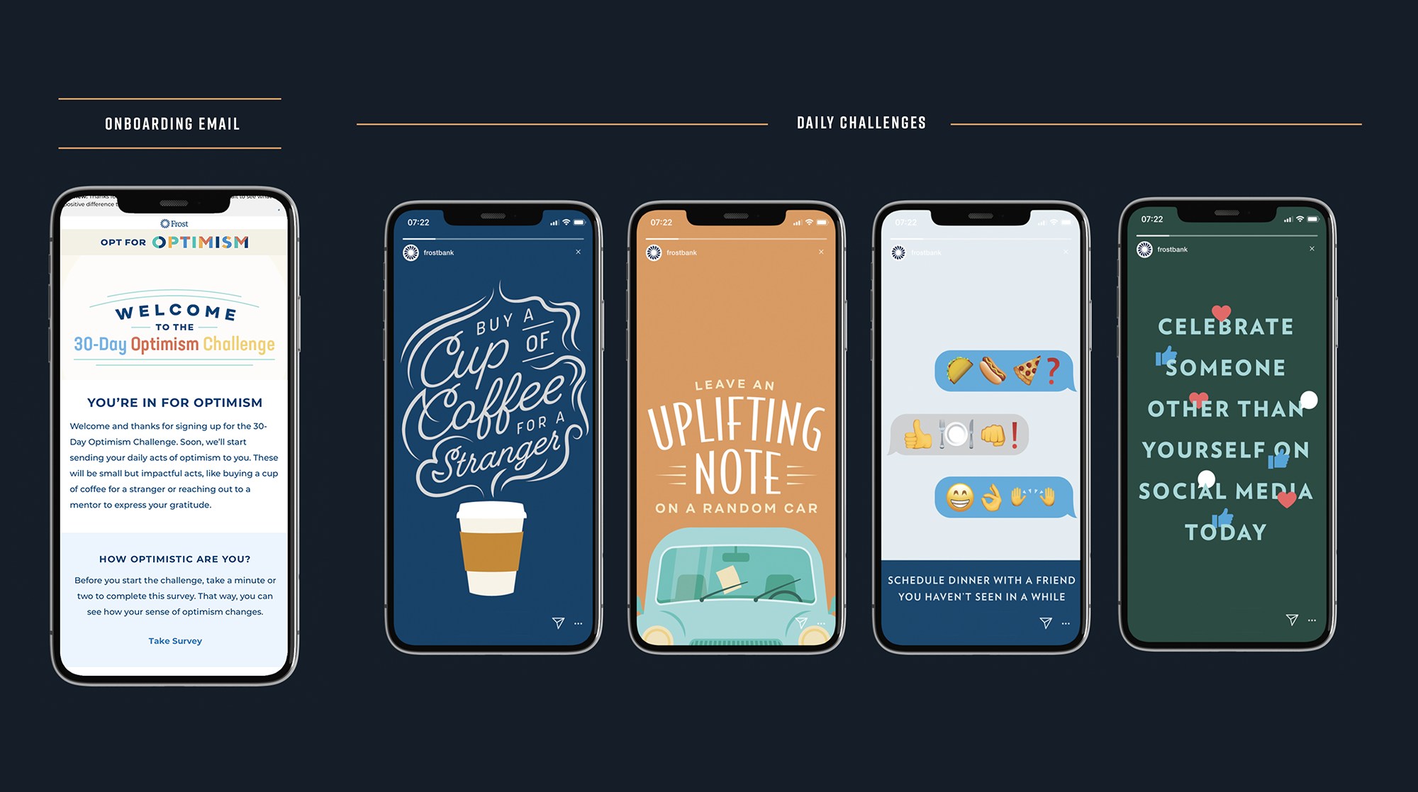
We designed the 30-day Optimism Challenge as a daily program of optimistic challenges to teach users how to act like an optimist. Users could sign up with their email address to receive daily emails or follow along on social.
In 2020, we redesigned the challenge to be better suited for practicing positivity during Covid from home. We created all new challenges as well as decreased the number of challenges knowing culturally, people were feeling overwhelmed.
Optimism Quiz
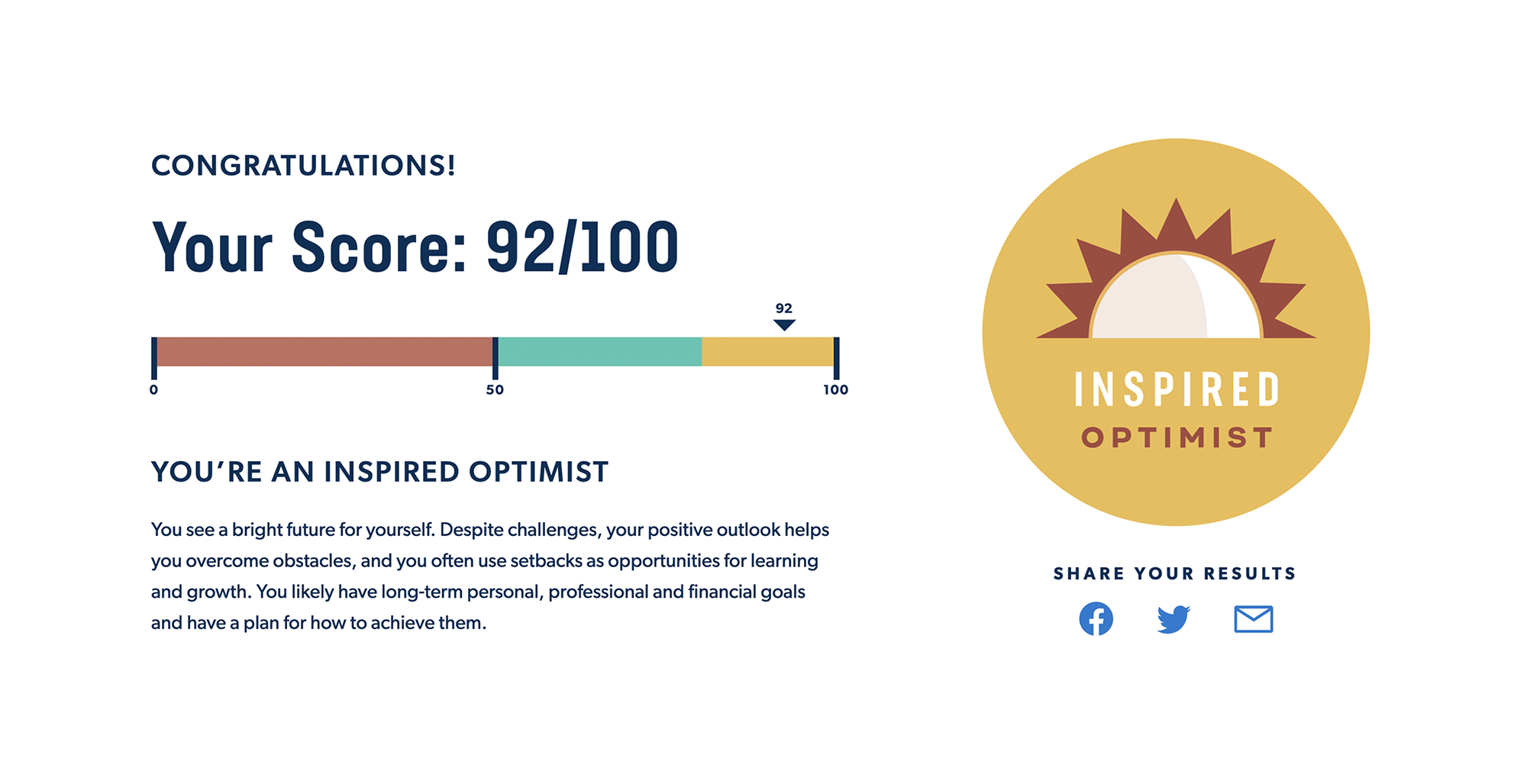
Everyone loves an informative quiz. We leveraged Carnegie Mellon's Optimism Quiz to help site visitors determine their optimism levels. This quiz results page was designed to give users a way to better understand themselves before diving into other site features.
Educating users without overloading them was a challenge. For this experience, I tested the quiz results page copy and design to determine what info was most interesting to our audiences.
Scalable Information Architecture
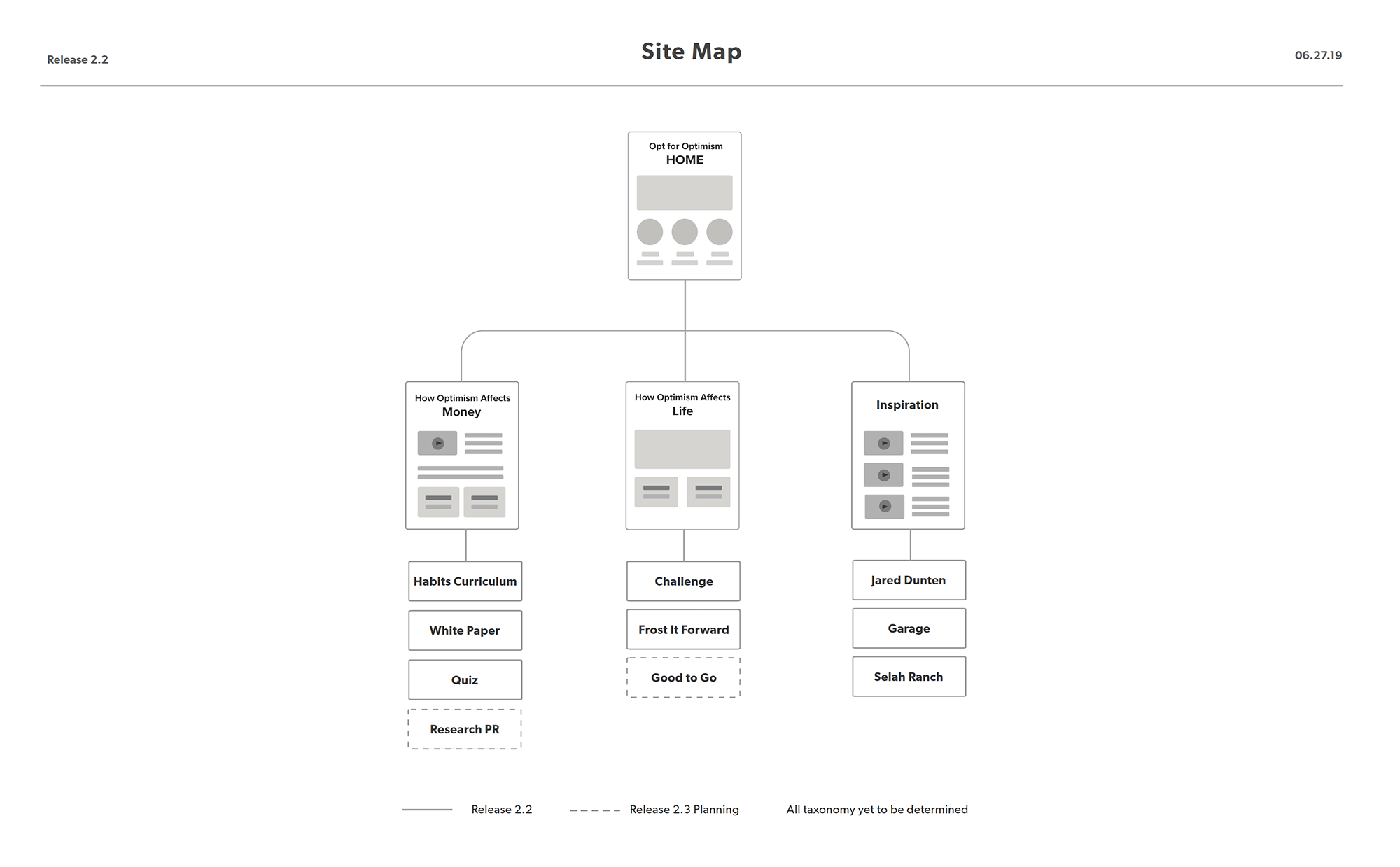
Due to the multi-year timeline of Opt for Optimism, one of the biggest challenges was creating an information architecture that could scale over time with the continual addition of new features and activations.
To do this, I designed a navigation that clearly guides users to the type of optimism content that most interests them by organizing site features by their benefit to the user. The three primary groups were Optimism's Impact on Money, Optimism's impact on life and general optimism inspiration. In testing, this organization worked well to guide users to what they wanted to see first.

